Starting point
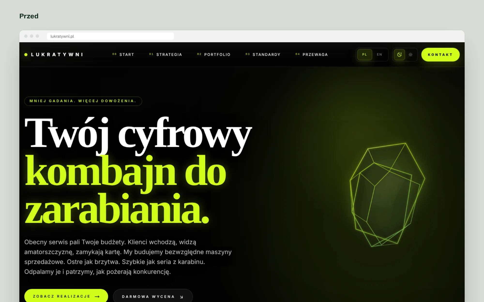
The first version of the site was built to impress: a dark background, glowing lime, 3D crystals, layers of animation and very sharp slogans. It made an impression, but it didn’t earn the trust of business owners who pay for a website with their own money and want enquiries from it, not fireworks.
We set one goal: keep the brand’s energy, add seriousness and one simple idea.
The idea: the dot over the i
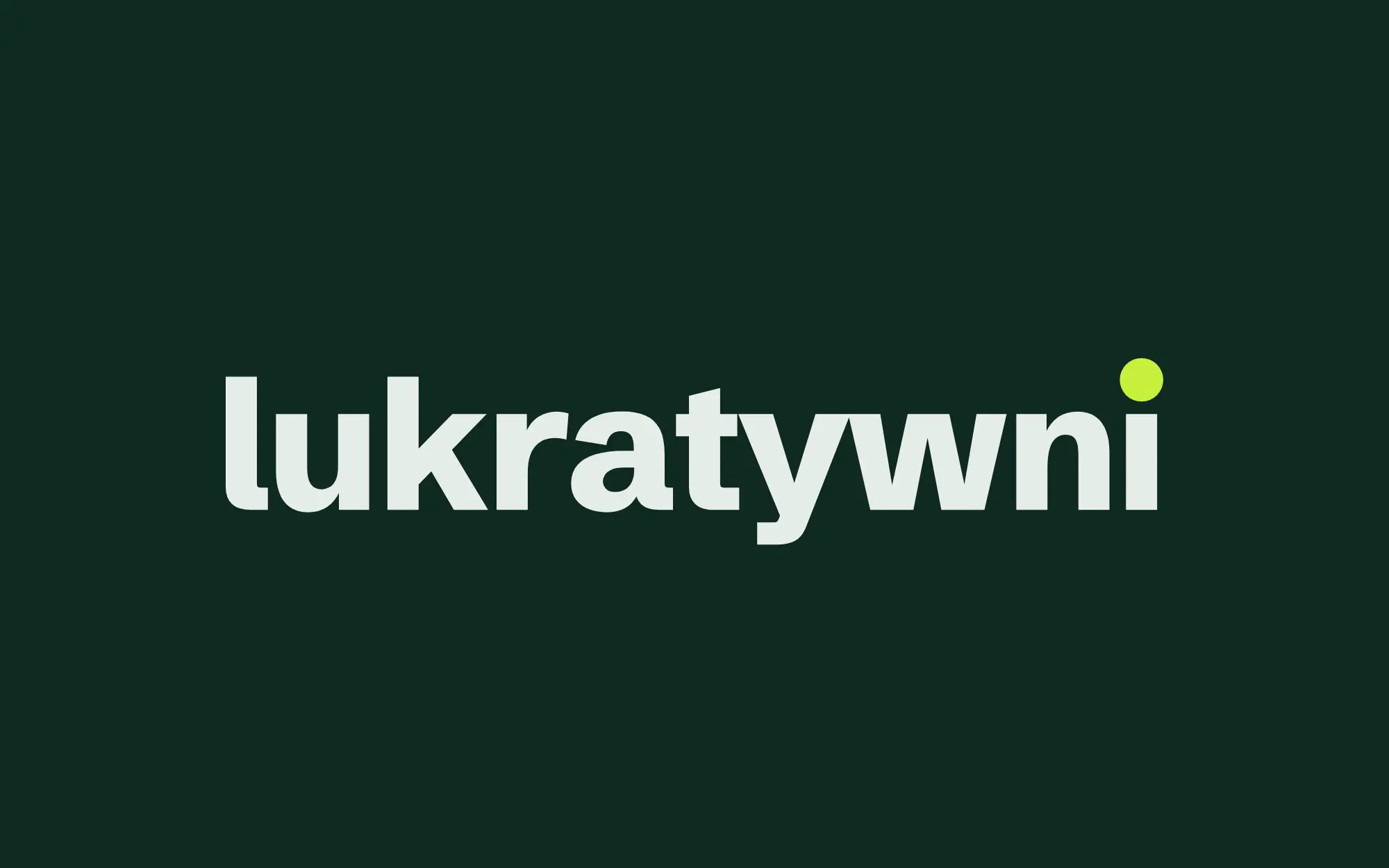
In Polish, “putting the dot over the i” means finishing something down to the last detail. That is what we do with every site, so the dot closes our name. In the wordmark, the dot over the last i is larger than usual and rises above the letters.
The symbol is the dot alone: a lime dot on ink. It is the same dot that sits over the “i” in the name and closes our headlines.
Rejected directions
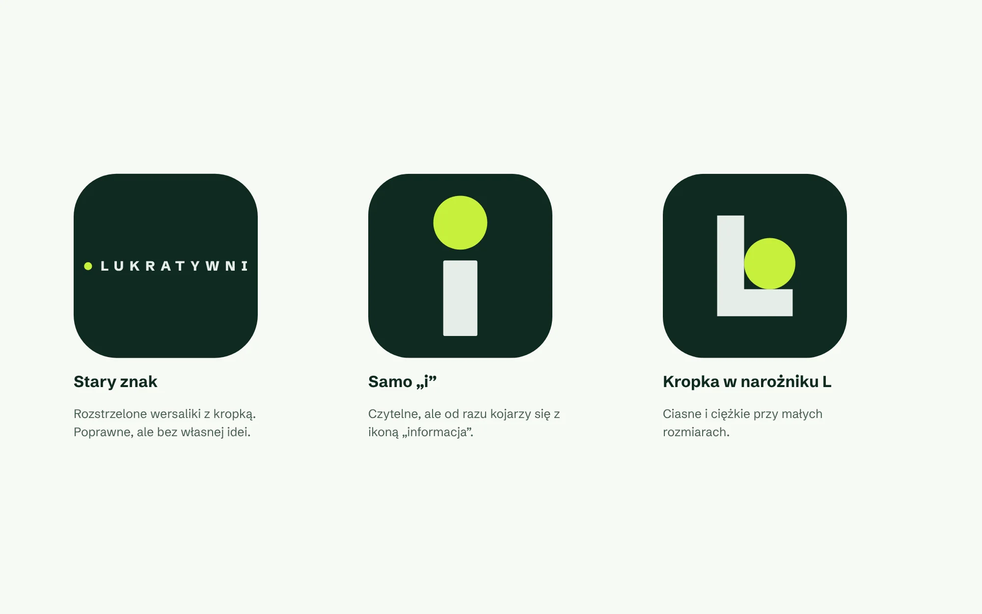
Before the current mark we explored other routes. A lone “i” in a square looked like every app’s info icon. A dot in the corner of a large L was heavy and lost legibility at small sizes. A dot in a lime frame looked like a camera icon. The old spaced-capitals mark was correct but had no story.
A symbol for every size
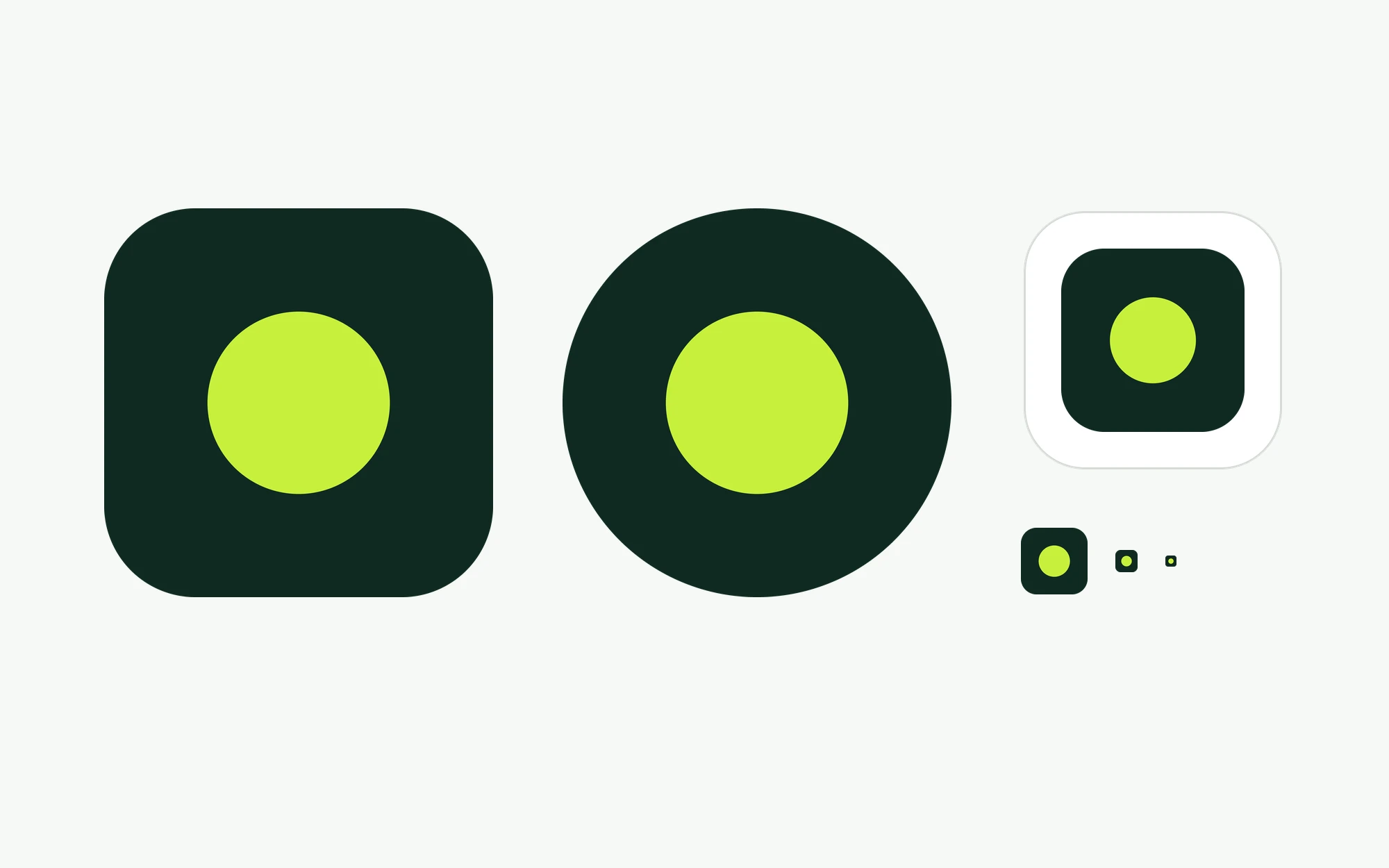
The symbol works as an app icon, a circular profile picture and a 16-pixel favicon. It is one large dot on a dark background, so it reads the same at every size.
The system: ink, paper, signal
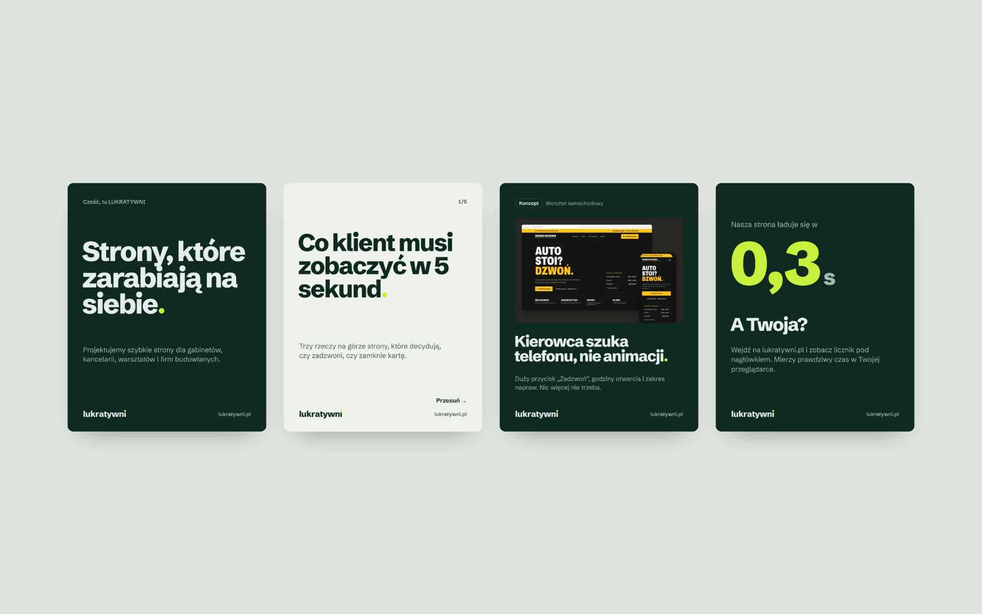
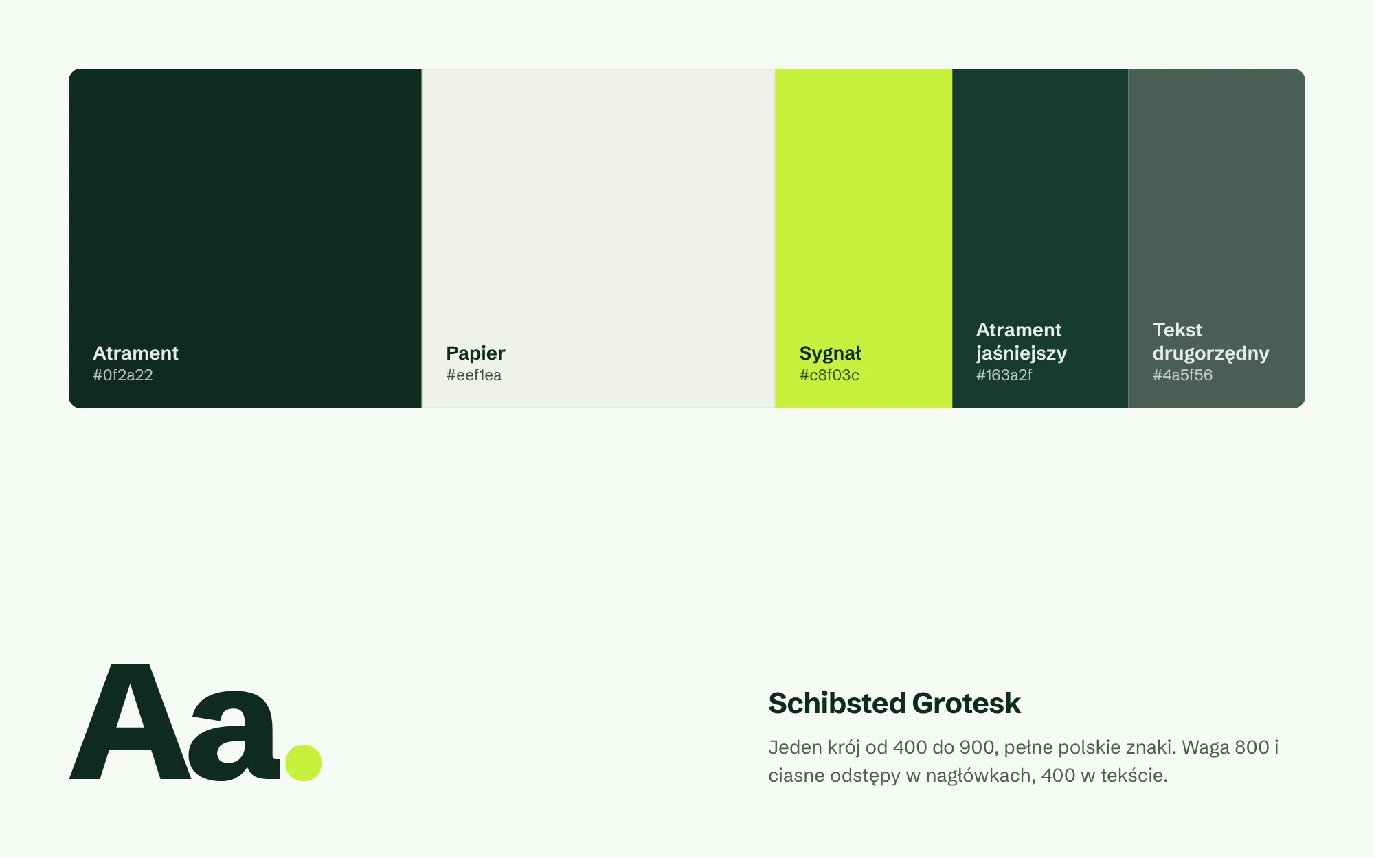
The palette comes from bookkeeping, because the name is about earning: deep ink green, ledger paper and a lime signal used sparingly, like a full stop.
One typeface, Schibsted Grotesk, from body text to huge headlines. Every text colour meets WCAG AA contrast.
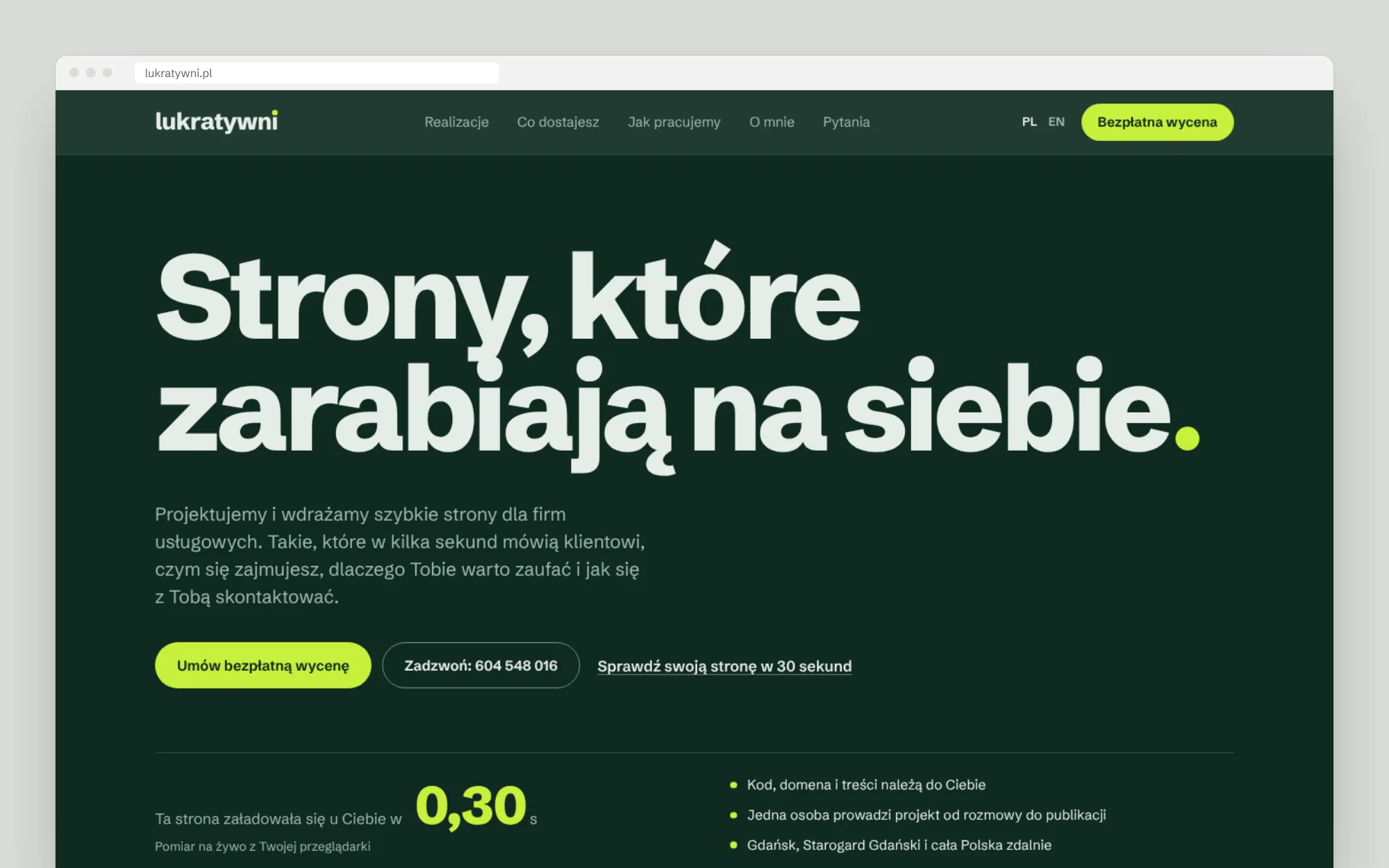
Speed measured live
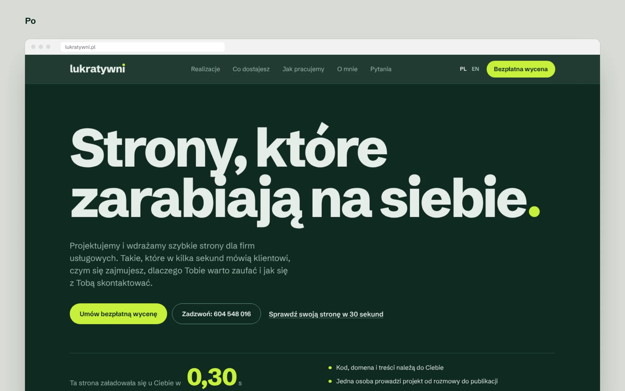
A counter under the headline shows the real load time in the visitor’s browser. The process section builds an example site before the visitor’s eyes, and the “Check your website” test gives an instant score and carries it into the contact form.
We rewrote the copy from scratch, short and specific. An automated accessibility audit reports no errors.
Social media
A starter kit: avatar, Facebook cover, the first posts with captions and story templates. All built on the same rules, so the profile looks consistent from day one.